Logos & Branding
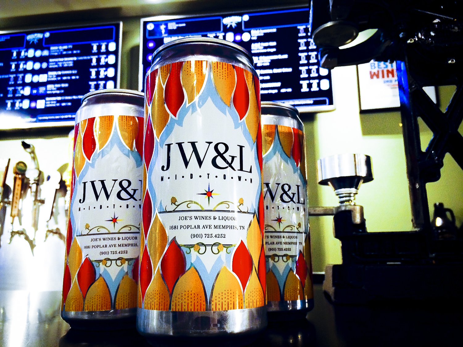
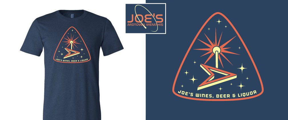
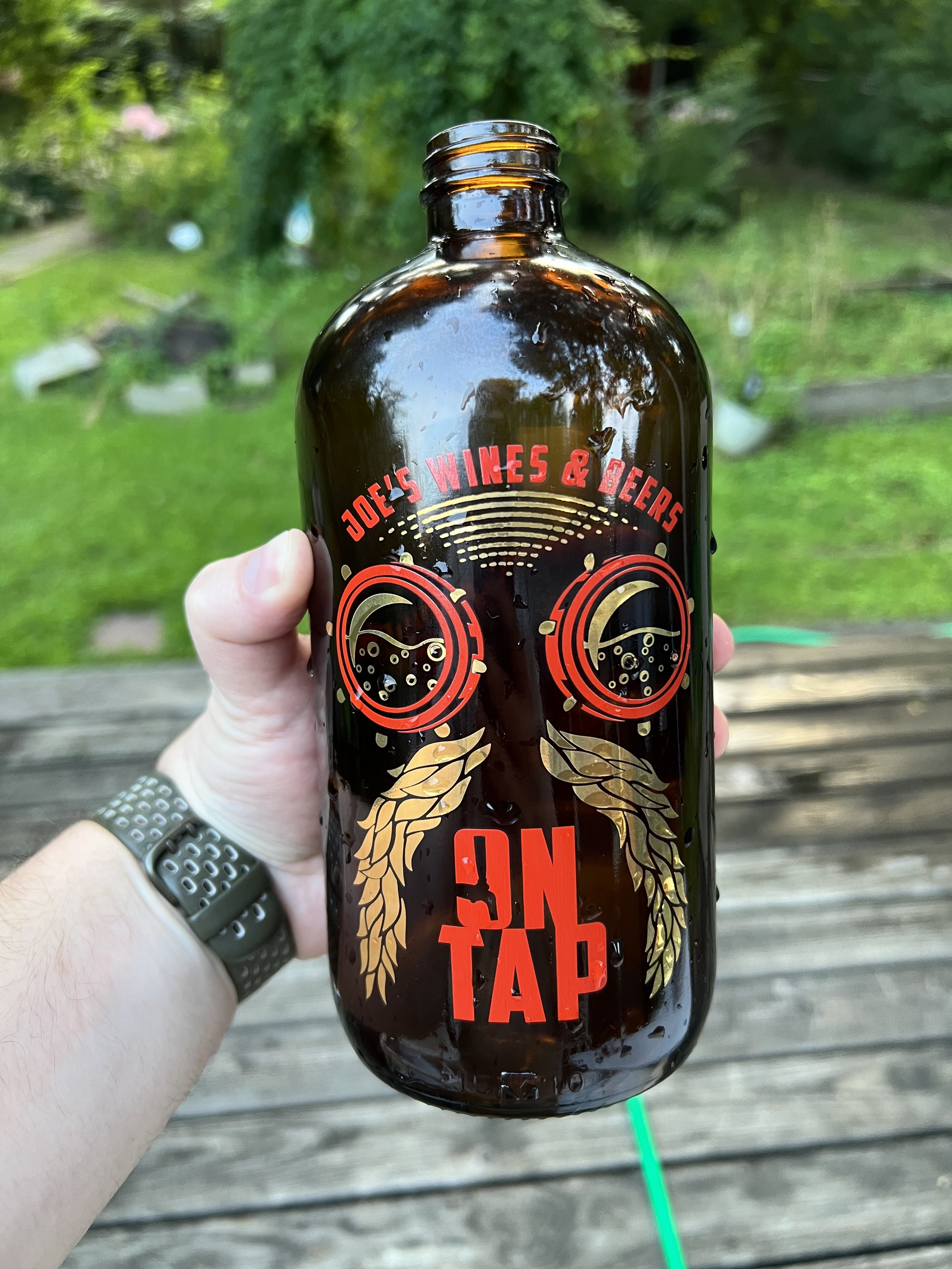
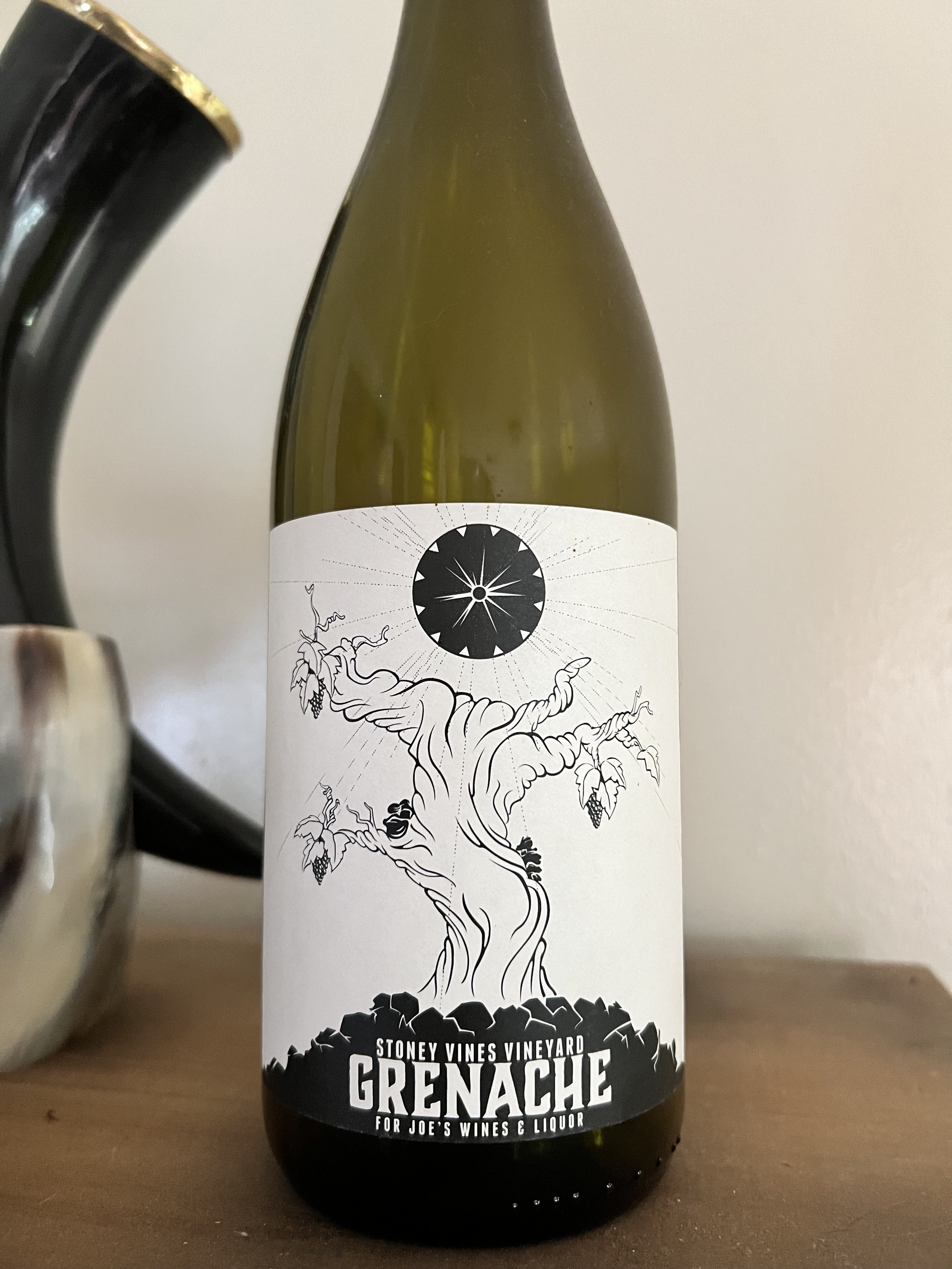
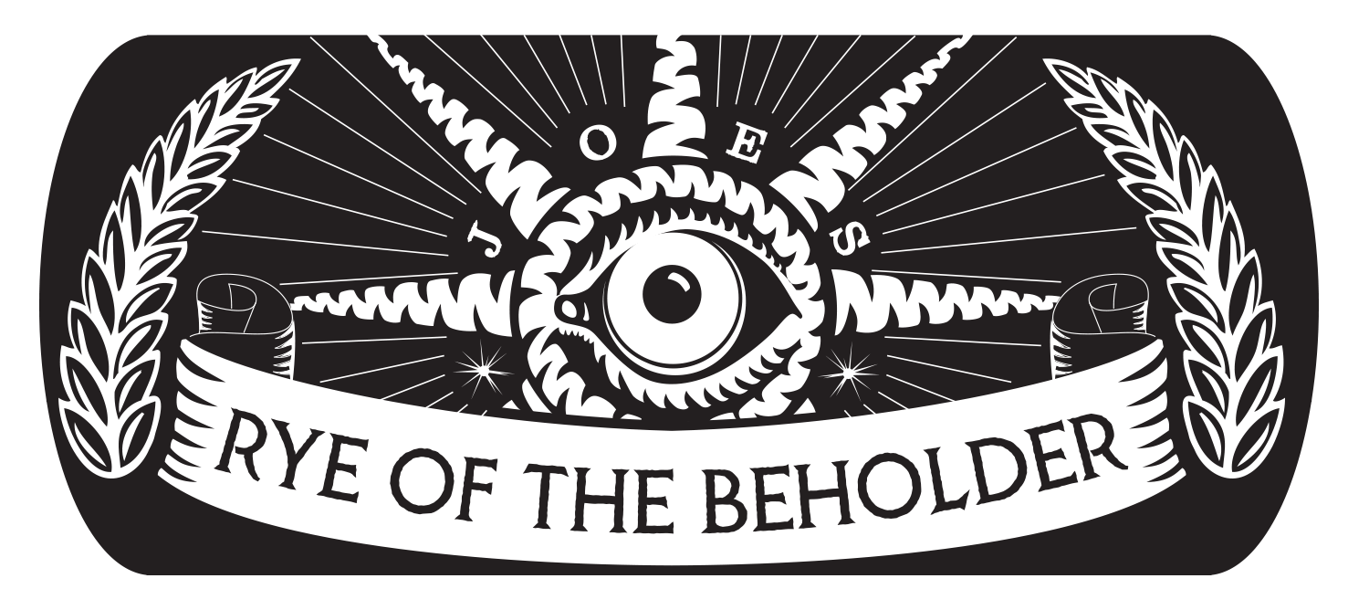
Joe’s Wines & Liquor had a great identity just barely hidden beneath the surface. The Sputnik—an iconic vintage sign spinning in our parking lot—screamed for a retro 1930s-1950s sci-fi aesthetic in our branding. When Growler stations started popping up all over the city, these to-go-only beer bars presented the perfect opportunity to put many of my logo iterations to good use, creating a variety of limited-release containers for our customers’ fizzy needs. I crafted homages to Memphis celebrities (in spacesuits) and honored former employees, infusing local flavor into the designs. The new branding resonated with our customers, leading to increased engagement and a boost in sales with each new Growler edition. When I initially updated Joe’s logos, beer wasn't a significant part of our identity, but that changed dramatically by the time Growlers and Crowlers hit the market. I designed a new logo incorporating "Joe’s Wines, Liquor & Beer," reflecting our expanded focus.
Printing the logos on Growlers required using no more than two colors, as printing costs skyrocketed with each additional hue. This limitation became a fun challenge, pushing me to creatively use negative space as a color.